
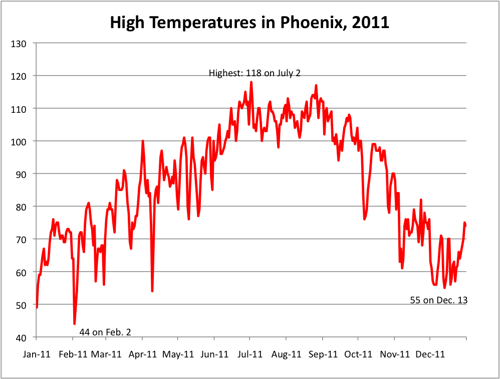
 As a means of learning about data and the various ways to express and visualize it, our assignment for the week was to take a random city and map out its high temperature over the course of a year. I was assigned Phoenix, and I found that in the year 2011, the city certainly had it’s fair share of sweltering days. While the temperature dipped to a high of 44 degrees in February and a high of 55 degrees in December, it hit it’s peak in the dog days of Summer, topping out at a burning 118 degrees on the second day of July.
Though the instructions very appreciatively spelled out every step of the way, I had some trouble labeling an individual data point (Feb. 2 & Dec. 13) on my graph. Every time I clicked the individual point and tried to add a data label, it added a label to every point on the graph. Eventually, I subverted this by messing with the label in the Format -> Data Series on my tabs, and manually inserted them that way. With the exception of that however, the assignment was smooth sailing.
Overall, I truly enjoyed working with a medium that I haven’t spent much time on previously. Though Excel is fairly straight forward in learning the basics, I had never worked with its chart visualizations before, so that was an entirely new concept to me. I see its use and practical applications, and as WRUF’s website turns toward data visualization for sports-related stories, I think my understanding of the subject will go a long way toward helping improve the website.
You are still making the same it’s/its error I have pointed out to you in several previous blog posts. You did get it right ONCE in this post: “I see its use and practical applications …”
In your post, you could have included these details to impress and inform an external reader: the title of Nathan Yau’s book, Python, and the CSV format.
Otherwise, good post and good chart. (It would be better to make the chart the full width of your blog post instead of tiny.)