The Revival of Real Estate in Alachua County Continues

Fast. Fluid. Flexible. Those are the things Matchmaker Realty’s Gia Arvin says it takes for a real estate agent to be flexible. Moving into the family business in 2003, Arvin has seen the peaks and dips of real estate. With the Recession of the late-2000s behind them, real estate is beginning to rise within Alachua County and across the state of Florida.

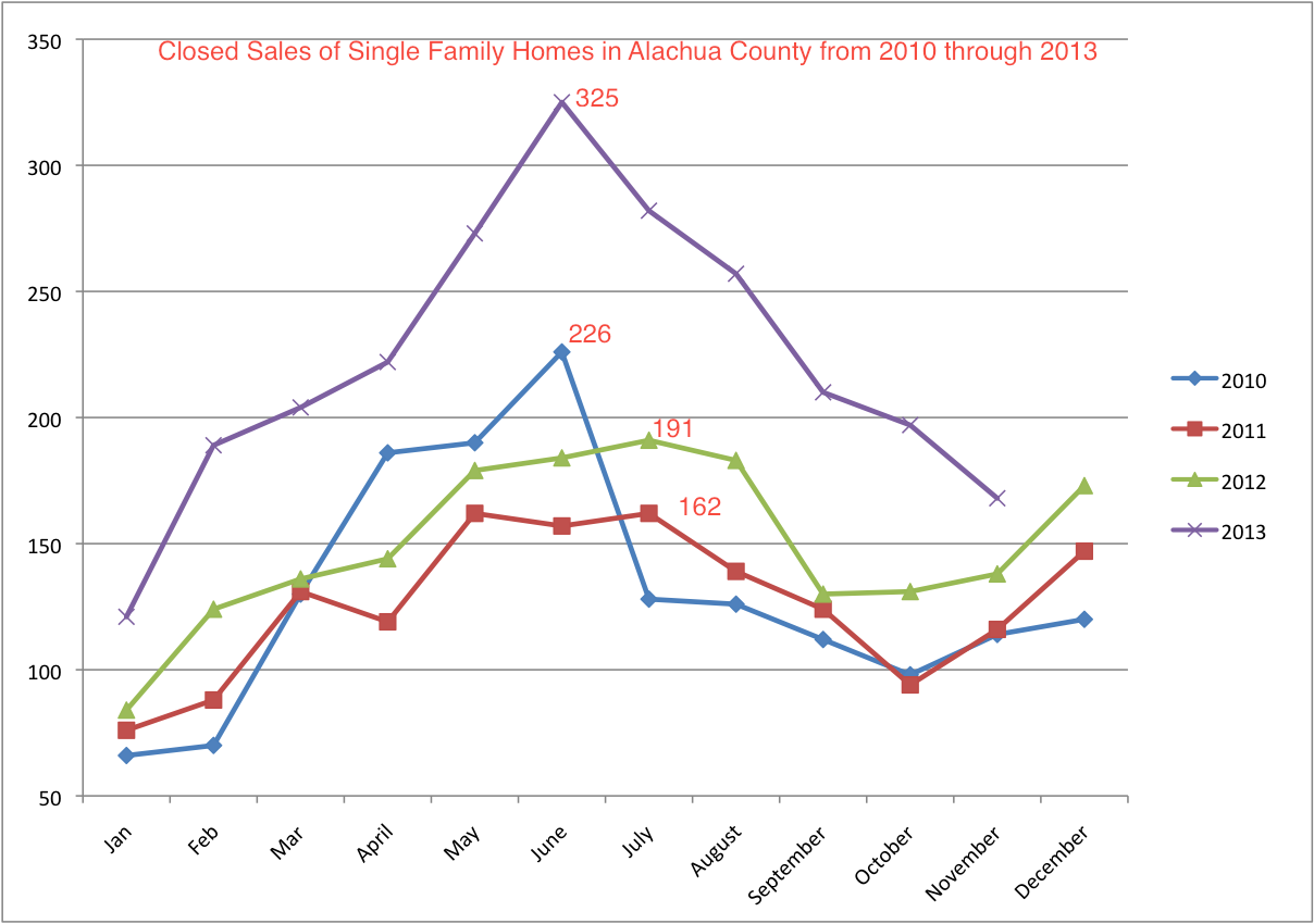
These are the number of closed sales of single family homes in Alachua County from the start of 2010 through November of 2013. Due to the Florida Realtors policy on providing data, 2010 and 2011 are estimates based on graphing data available.

Closed Sales

As consumer confidence rises and the market bounces back, Arvin reflects on an up-and-down decade in her profession, and the measures she and her husband Scott took to maintain success in the tough times.

On a hectic afternoon where Gia represented the seller of a home in Oakcrest and her husband Scott represented the buyers (an absolute rarity for the couple), they had to manage two closing deals, both of which took much longer to process than anticipated. It took after hours work from Matchmaker Realty and two dedicated law offices (The Toney Law Firm and Salter & Feiber Attorneys at Law) to get everything settled on Friday night. Follow some of the afternoon’s events, and the aftermath, through picture and audio.

https://www.youtube.com/watch?v=cfd1C2naMpA

Marilyn Palumbo sold her home in Oakcrest and moved into the golf community of Meadowbrook last week. She talks about leaving the memories of a house she lived in for 32 years behind, putting a new foot forward, and reflects on the entirety of her experience moving from one to the other.

To see how the the median sale price of homes in Alachua County stacks up against the median sale price average across the state of Florida for the year of 2012, see the graph below.

statevalachua

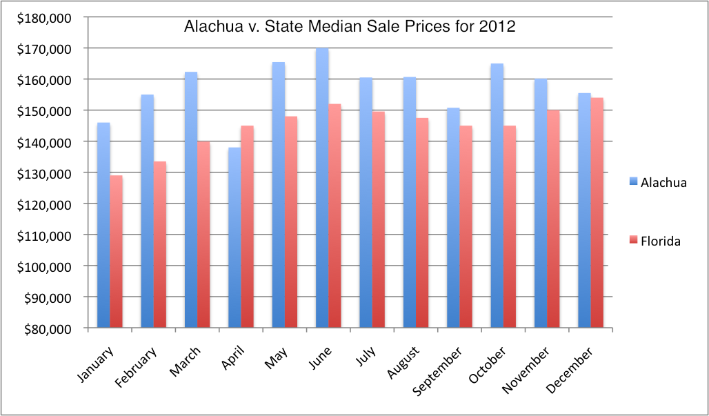
All data courtesy of Florida REALTORS, collected from Florida’s multiple listing services.

From Still Pictures to Moving Ones

Chapter 13 of Kenneth Kobre’s book Photojournalism: The Professionals’ Approach details the world of journalism via video, covering the differences between photo and video and how to effectively master the concept.

  1. Though any newsworthy story can be told through video, the most successful ones are those that find compelling, central characters to build a story around. Whether it’s a profile piece or the subject represents a larger cause or problem, they must be both articulate and engaging to create an interesting story. (pp. 311-312)
  2. One of the drastic differences between camera and video camera (and beneficial to a videographer) is that instead of waiting for a singular moment to catch the perfect image, a video photographer can roll for multiple minutes. Because of this, one can focus on capturing extended sequences as opposed to moments. (pp. 313-314)
  3. In building a sequence, the book provides a few handy tips on the subject. Even in the case of shooting a static (still) shot, shoot for a minimum of 10 seconds. Anticipate reaction with your subjects, and pan from the emotion to the “motivation.” One should also focus on closing each sequence effectively, either by pulling back on the shot, or allowing the subject to walk away from, or entirely out of, the frame. (pp. 324-326)
  4. Once the footage has been collected and placed in the video editing software of choice (the book references the standard Apple Final Cut Pro), it’s wise to name and organize the footage to streamline editing. If large-scale segments have been shot over a period of days, separate each day of shooting with a bin, before naming the clips. Standard industry names for differing types of clips include SOTs (sound on tape, for interviews) and b-roll (general video used for the voiceover sections). (pp. 328-329)
  5. Avoid the jump cut! Though this is a fairly obvious tip to those who have edited video before, it’s an important note nonetheless. The book only references a jump cut as two pieces of SOT merged together, so the subject’s head jerks at the edit point. However, from working in television for a little bit now, I also know a jump cut can occur in b-roll, when the subject appears in back to back sequences without ever leaving the frame in the previous one. Both types of jump cuts are the result of sloppy editing, and should be avoided at all costs. (p. 332)

A Weekend Spent with Art and Music

When I chose to do the 32nd Annual Downtown Festival and Art Show as my audio and photo story, I really wasn’t sure what to expect. I had never before been to the festival in my years as a student here, so I was stunned to see Main St. and it’s encompassing area transformed into a cultural hotspot for the weekend.

From unique forms of art to empowering live music to funnel cakes and corn dogs, I could never have expected what was in store for me downtown. I interviewed four amazing people, Jack Wicks, Nancy England and Cindy Warner, all seen in the story, and Sharon Bartz, a sculpture artist who I just didn’t have the time to fit. Each and everyone of them brightened my afternoon with stories of their inspiration and passion for art. England and Warner, in particular, were tremendously enthused about the festival, as mother and daughter have come for over 20 years.

All of the music associated with the story was recorded live, with artist permission, and I placed at least one or two photographs of each musical performance with each corresponding song. The irish infused jig, known as Drop the Stick, was a particularly fun listen, and I felt the music created by the cellists, harp player and violinist were all too beautiful to leave out.

Though I loved every minute of interviewing and photographing for the story, I struggled mightily in the editing process. Audacity erased my project as I was preparing to export, forcing me to start from scratch, before mysteriously dropping roughly 20 seconds of my final audio, something I didn’t notice until I was well on my way in iMovie. I had to re-edit my interview sound and insert it into the project again before I finally finished.

All in all, I truly enjoyed reporting in a whole new sense. Though I’ve reported in print, radio, and television before, I had never gone out to report a photo story. Though I did take multiple pictures earlier this semester for Photo Assignment 2, there was no real interviewing involved with the process, so this mix of both was simultaneously engaging and enjoyable. And I think I’ve fallen in love with my camera.

Caballo Blanco’s Last Run

Each February, tucked away in the tiny Mexican town of Urique, there is a race known as the Copper Canyon Ultra Marathon, inspired by the one locals call “Caballo Blanco.” His name is Micah True, and his Race for Life in 2012 would ultimately become his last.

The nearly six minute story tells the story of the Tarahumaras, locals who compete against foreigners from far and wide in the 80 kilometer marathon. Known locally as the Caballo Blanco ultramarathon for the foreigner who founded it, the marathon is a opportunity for foreigners to run with the locals, and for the foreigners, a chance to win food based on the distance they complete. In a town going on a two year drought (at the time of the report), that food, as the narration puts it, could be the difference between life and death.

From the beginning, when the Norwegian-speaking narrator (accompanied by English subtitles) hints at True’s last race, I was hooked. The natural sound of a Mexican band wafts into the story as the viewer is taken on a picturesque train ride through the country to Urique. A combination of still photos and scene-setting video gave me an idea of the size and scope of the mountain range and the marathon itself, before we finally reach the bulk of the story, which included both True, and the competition.

I was overcome with amazement and admiration when I saw what went into participating in the 80 kilometer race. Watched the competitors sprint through the Copper Canyon with shots at varying distances (some strikingly beautiful in a cinematic overhead view, others from a captivating point of view angle), I was stunned at how daunting their trek often appeared to be.

The video portions of the story are tremendous. From the cinematic point of view train ride to the harsh huffing-and-puffing of racers as they wind along the route, I often felt like I was accompanying them on their journey. As the kilometers stretch on and the contestants bow out, the still photos capturing the agony and exhaustion of the marathon’s racers documents the emotion in an impressive and visually appealing fashion.

Though I wasn’t a huge fan of having to read subtitles (as it took away from my appreciation for the visual aspects), it wasn’t bothersome, and the segues taken from interviews with True and Urique resident Mickey Mahaffey are well-done. The narration adds context, but it’s True, with his carefree disposition but genuine concern for the marathon’s participants, who truly makes the story come alive.

Ultimately, the nat sound goes a long way toward making it feel real. The Mexican mariachi band takes us to Urique, the sounds of the canyon carry us through the race, and as the final image of True wading into the water is accompanied by the sound of it, we find out that he passed away on a trek through the New Mexican wilderness, which left me as cold and empty as the piercing silence that follows.

Editing a Story; Telling it in Multiple Mediums

Chapter six of Jonathan Kern’s book Sound Reporting teaches a very tough truth in the opening paragraph: the job of an editor is a demanding and often thankless job. Afterward however, the chapter delves into tips and tricks for editing stories.

  1. Story structure can vary dramatically, with the focus of the story being structured “vertically” or “horizontally.” While vertical stories are in-depth reports that narrow into a single idea, horizontal reports have an overarching, “wide view” theme of a news event. (pp. 94-95)
  2. There are various ways to tell a story, and while writing to the actualities is always key, the book advises against the simplistic “connect-the-dots” approach, where the reporter structures the story around the various sound bites he or she has. Sometimes it’s easy– chronological or geographical stories are structured for the reporter, but other possibilities include the “interrupted action” or illustrating the problem. (pp. 97-99)
  3. Copyediting is a major part of the editing process, and things to avoid producing in reports include echoes (consonant actualities and lead-ins), unidentified actualities and convoluted identifications. While copyediting can go a long way toward eliminating these devices, that’s not always the case, so Kern advises the best practice or listening to the report and reading the copy at the same time. (pp. 108-111)

Meanwhile, chapter twelve of Kenneth Kobre’s Photojournalism: The Professionals’ Approach covers the varying aspects of multimedia as they relate to journalism, a relevant and useful topic for prospective journalists, particularly in a generation where knowledge of those tools is becoming nothing short of vital.

  1. The book answers an often-asked question of whether to interview or photograph a subject first by suggesting the best practice might be to interview, photograph, then follow up, so sound and visuals can best coalesce with each other. (p. 274)
  2. Kobre includes some interesting tips for interviewing, and while some are fairly obvious (listen, ask follow ups, ask open-ended questions), others aren’t. Among those, the book recommends asking questions in pairs, including your answer in the question, and pausing after responses to allow a subject time to fill in, all of which could make for better actualities. (pp. 280-281)
  3. Another interesting suggestion Kobre makes is to interview subjects in their active environments. Interviewing people while they are at work gives what the book calls “a more immediate feel to an interview”, allows for better ambient sound and often contributes to producing a better story. (pp. 281, 286)
  4. A useful tip that the chapter closes on can be applied toward our upcoming photo/audio story. Kobre writes about pacing one’s photographs; on one hand, you don’t want to bombard the viewer with multiple images in a short time, but you need enough images so as to keep their attention through the story. As a general rule of thumb, 3-7 seconds for each photograph seems sufficient. (p. 305)

Covering the Issues and Producing in the Field

Two chapters from two different books make up this week’s readings, with both overlapping to give prospective producers and reporters insight on what to do in the field. Chapter Five of Jonathan Kern’s Sound Reporting covers the intricacies of producing from the field.

  1. When preparing to produce a story in the field, leave as little to chance as possible. Find contacts ahead of time, so in that sense, you at least have resources guaranteed. Building a list of contacts with information on what they’re ‘experts’ in, what they talked about, and who else they might recommend talking with is recommended. But it’s not just having interviews prepared. A field producer also needs to know how to get from point A to point B, and the best methods to get there. Build a schedule with who you’re meeting with, when and where, to better help organize the trip. (pp. 75-79)
  2. To paint a better picture when telling the story, take written or audio notes describing the surroundings, record copious amounts of ambience, “slate” the sounds you’re hearing, and make sure the audio is high quality. In general, the more that you can record, the better. As the book advises, be prepared to record from the minute you get up until you go to bed at night. (pp. 82-83)
  3. Because things can change in an instant from the field, understanding filing a report from a remote location is essential. At big-time media events, chances are, there will be filing centers’ and filing windows, so being aware of those is critical. In general, the book advises to practice filing in advance, and have a backup plan, because as is often the case with relying on technology, something can go wrong. (pp. 86-90)

Meanwhile, Chapter Ten of Kenneth Kobre’s Photojournalism: A Professionals’ Approach talks about the importance of journalism’s ability to cover important issues and affecting change.

  1. It’s one thing to talk about issues, it’s another thing entirely to show them through photography. In The Power of Photography, Vicki Goldberg documents cases where it affected change, chief among them the passage of the Civil Rights Act, courtesy Charles Moore photos from Life. (pp. 203-204)
  2. Alcohol: Bringing Us Together, Tearing Us Apart, was a great example of a photo story that presented both sides of an issue. While it doesn’t change anything per se, it brings to light a very divisive issue. On one side, alcohol as seen as a lubricant that induces good times and good friendship, on the other, Brian Plonka’s photo story shows the tragedy of what can occur when irresponsible decisions are made under the influence. (pp. 208-211)
  3. By developing a feature beat, a photographer can produce meaningful journalism. Once an idea has been developed, and research has been collected, a photographer can begin looking for unique and visually appealing ways to tell the issues associated with a beat. I haven’t ever considered beat photography, but reading about it makes me understand it’s a viable way to cover issues. (pp. 212-218)

A Valuable Lesson in Data Stripping & Geocoding

Though the process was at times frustrating, creating a Fusion Table with all the schools from the East Coast counties of Nassau, St. Johns, Flagler, Clay and Putnam turned into a very rewarding exercise. Once the data is in a presentable .csv format, Google makes the rest easy. But there were a lot of hiccups in getting my table to this point.

Stripping data from the Master School ID from the Florida Department of Education was the first step, next, was assessing the data that would be essential to the final product: the school’s name, all parts of the mailing address (line#1, city, zip code), the grade code, and the type of school it was. After that, I used the concatenate function to combine lines together, then used the proper name formula to properly capitalize the schools and addresses. Learning how to incorporate formulas took a little while, until I pieced together that you needed to create a new column to bring a formula all the way through.

Once I stripped the data I needed and imported it into a new worksheet, I finally got to the geocoding stage. At first, the geocoding was only reading my five counties, placing markers in Interlachen, CT and Nassau in the Bahamas. Once I redirected it toward my final addresses, it smoothly placed my markers on the map, creating my final product.

Though working through Excel and the Fusion Tables were difficult at first given my very rudimentary understanding of both, by the time I embedded this table into the post, I felt far more confident about my skills in regards to both, making for an very productive exercise.

Maps… the Intuitive Visualization

Chapter 8 of Nathan Yau’s book Visualize This: The FlowingData Guide to Design, Visualization, and Statistics covers the most popular form of visualization, thought not one traditionally thought of in regards to data. The chapter breaks down plotting points and creating data to display on maps, before turning to different ways to display data through the map medium.

  1. Two essentials for determining what goes where on every map are latitude and longitude, and to get those, you need to use something Yau refers to as geocoding. By using a handy service (Yau suggests the free website geocoder.us), one can plug in an address and wait while the service queries its database before spitting out the latitude and longitude for wherever in the world that address might be. (p. 273)
  2. Once the data has been created, you can begin to plot the points. Yau recommends thinking of maps in layers, the bottom layer being the map, with the next layer being whatever type of data you choose to share in the space. Each different set of data points you chose to show (say for instance, every McDonald’s and Burger King in North Central Florida) is a different layer. (pp. 277-278)
  3. Scaled points can add depth and spatial understanding to a map hoping to show proportions. The book uses an example of bubble sizes as they relate to adolescent fertility rates, and just by examining the map and understanding the purpose of bubble sizes, you can easily and quickly identify that the highest rates are located across the continent of Africa, even without a legend to help quantify the size. (pp. 283-284)
  4. Another interesting way to create data on maps (and one of the most popular in regards to mapping regional data) is through the use of color, what is referred to as a choropleth maps. While the bulk of this section contains his coding tips and tricks to graphing a choropleth map, I found the information on map shading particularly intuitive and useful. (pp. 286-302)
  5. Touched upon in the intro and expanded upon toward the end of the chapter, mapping in relation to time and space is another handy and engaging way to display data. The book shows different stylistic choices when it comes to time progression, with multiple maps in the same space being differentiated by progressing headlines, but the method I found to be the most visually appealing was the animated one. Yau’s example of the growth of Walmarts and Targets across the country was very interesting, and the coding that follows, while complex, could be a very handy tool in the future. (pp. 303-325)

Using Visualization to Map out the High Temperatures in Phoenix


PHX Weather 2011As a means of learning about data and the various ways to express and visualize it, our assignment for the week was to take a random city and map out its high temperature over the course of a year. I was assigned Phoenix, and I found that in the year 2011, the city certainly had it’s fair share of sweltering days. While the temperature dipped to a high of 44 degrees in February and a high of 55 degrees in December, it hit it’s peak in the dog days of Summer, topping out at a burning 118 degrees on the second day of July.

Though the instructions very appreciatively spelled out every step of the way, I had some trouble labeling an individual data point (Feb. 2 & Dec. 13) on my graph. Every time I clicked the individual point and tried to add a data label, it added a label to every point on the graph. Eventually, I subverted this by messing with the label in the Format -> Data Series on my tabs, and manually inserted them that way. With the exception of that however, the assignment was smooth sailing.

Overall, I truly enjoyed working with a medium that I haven’t spent much time on previously. Though Excel is fairly straight forward in learning the basics, I had never worked with its chart visualizations before, so that was an entirely new concept to me. I see its use and practical applications, and as WRUF’s website turns toward data visualization for sports-related stories, I think my understanding of the subject will go a long way toward helping improve the website.

The Tools of the Trade

After introducing a variety of methods with which to gather and organize data, Nathan Yau’s book Visualize This: the FlowingData Guide to Design, Visualization, and Statistics turns toward the process of visualizing the data in Chapter 3.

  1. When it comes to visualization, out-of-the-box tools are a beginner’s best friend. While some tools like Excel and Google Spreadsheets are fairly straight forward, others, like Many Eyes allow for a greater immersion of data. Many Eyes allows its users to interact with their data in a variety of methods, from traditional tools like line graphs and scatterplots, to more advanced visualizations like word trees. While Many Eyes is a valuable tool for data exploration, its existence in public domain prevents users from inputting private or classified data. (pp. 54-60)
  2. Though understanding data and visualization is nice, with a little programming knowledge, a user can expand past out-of-the-box to visualize data in more unique and interesting ways. Much like different visualization tools, there are a variety of coding options: Python, PHP, Processing, Flash and Actionscript, among others. Each has their own benefits. Processing, while basic, offers quick and easy programming access. For more interaction and animation, Flash and Actionscript are the way to go. (pp. 61-67)
  3. Recently, there has been an emphasis placed on visualization that can be run through a basic browser with applications like HTML, JavaScript, and CSS. Some, like Protovis are all-encompassing visualization programs. Of the browser run applications, the book suggests JavaScript is the most user friendly. (pp. 67-69)
  4. Of all the data-visualizing softwares mentioned, Yau makes it known his favorite is R. Specifically designed to analyze data, R was built by, and is maintained by statisticians. With just a few quick lines of code (or less) you can quickly build graphics. Yau’s right: the website is very outdated. But it provides base drawing functions that allow the user to draw whatever they want within the plotting-frame, leaving the possibilities of unique graphing designs rather limitless. (pp. 71-74)
  5. In an entirely different realm from the other visualization techniques, both illustration and mapping are useful tools that can help interpret and display data in different manners. Adobe Illustrator is the so-called “industry standard” for graphic illustration, whereas Inkscape is its free alternative. Meanwhile, Google, Yahoo, Microsoft Maps, ArcGIS, Modest Maps and Polymaps are all different ways to present geographic data. Most maps are presented in the slippy map style, splitting smaller portions of the map into tiles which allow the user to pan and move across maps easily. (pp. 76-85)