Monthly Archives: October 2013

Maps… the Intuitive Visualization

Chapter 8 of Nathan Yau’s book Visualize This: The FlowingData Guide to Design, Visualization, and Statistics covers the most popular form of visualization, thought not one traditionally thought of in regards to data. The chapter breaks down plotting points and creating data to display on maps, before turning to different ways to display data through the map medium.

  1. Two essentials for determining what goes where on every map are latitude and longitude, and to get those, you need to use something Yau refers to as geocoding. By using a handy service (Yau suggests the free website geocoder.us), one can plug in an address and wait while the service queries its database before spitting out the latitude and longitude for wherever in the world that address might be. (p. 273)
  2. Once the data has been created, you can begin to plot the points. Yau recommends thinking of maps in layers, the bottom layer being the map, with the next layer being whatever type of data you choose to share in the space. Each different set of data points you chose to show (say for instance, every McDonald’s and Burger King in North Central Florida) is a different layer. (pp. 277-278)
  3. Scaled points can add depth and spatial understanding to a map hoping to show proportions. The book uses an example of bubble sizes as they relate to adolescent fertility rates, and just by examining the map and understanding the purpose of bubble sizes, you can easily and quickly identify that the highest rates are located across the continent of Africa, even without a legend to help quantify the size. (pp. 283-284)
  4. Another interesting way to create data on maps (and one of the most popular in regards to mapping regional data) is through the use of color, what is referred to as a choropleth maps. While the bulk of this section contains his coding tips and tricks to graphing a choropleth map, I found the information on map shading particularly intuitive and useful. (pp. 286-302)
  5. Touched upon in the intro and expanded upon toward the end of the chapter, mapping in relation to time and space is another handy and engaging way to display data. The book shows different stylistic choices when it comes to time progression, with multiple maps in the same space being differentiated by progressing headlines, but the method I found to be the most visually appealing was the animated one. Yau’s example of the growth of Walmarts and Targets across the country was very interesting, and the coding that follows, while complex, could be a very handy tool in the future. (pp. 303-325)

Using Visualization to Map out the High Temperatures in Phoenix


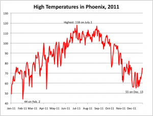
PHX Weather 2011As a means of learning about data and the various ways to express and visualize it, our assignment for the week was to take a random city and map out its high temperature over the course of a year. I was assigned Phoenix, and I found that in the year 2011, the city certainly had it’s fair share of sweltering days. While the temperature dipped to a high of 44 degrees in February and a high of 55 degrees in December, it hit it’s peak in the dog days of Summer, topping out at a burning 118 degrees on the second day of July.

Though the instructions very appreciatively spelled out every step of the way, I had some trouble labeling an individual data point (Feb. 2 & Dec. 13) on my graph. Every time I clicked the individual point and tried to add a data label, it added a label to every point on the graph. Eventually, I subverted this by messing with the label in the Format -> Data Series on my tabs, and manually inserted them that way. With the exception of that however, the assignment was smooth sailing.

Overall, I truly enjoyed working with a medium that I haven’t spent much time on previously. Though Excel is fairly straight forward in learning the basics, I had never worked with its chart visualizations before, so that was an entirely new concept to me. I see its use and practical applications, and as WRUF’s website turns toward data visualization for sports-related stories, I think my understanding of the subject will go a long way toward helping improve the website.

The Tools of the Trade

After introducing a variety of methods with which to gather and organize data, Nathan Yau’s book Visualize This: the FlowingData Guide to Design, Visualization, and Statistics turns toward the process of visualizing the data in Chapter 3.

  1. When it comes to visualization, out-of-the-box tools are a beginner’s best friend. While some tools like Excel and Google Spreadsheets are fairly straight forward, others, like Many Eyes allow for a greater immersion of data. Many Eyes allows its users to interact with their data in a variety of methods, from traditional tools like line graphs and scatterplots, to more advanced visualizations like word trees. While Many Eyes is a valuable tool for data exploration, its existence in public domain prevents users from inputting private or classified data. (pp. 54-60)
  2. Though understanding data and visualization is nice, with a little programming knowledge, a user can expand past out-of-the-box to visualize data in more unique and interesting ways. Much like different visualization tools, there are a variety of coding options: Python, PHP, Processing, Flash and Actionscript, among others. Each has their own benefits. Processing, while basic, offers quick and easy programming access. For more interaction and animation, Flash and Actionscript are the way to go. (pp. 61-67)
  3. Recently, there has been an emphasis placed on visualization that can be run through a basic browser with applications like HTML, JavaScript, and CSS. Some, like Protovis are all-encompassing visualization programs. Of the browser run applications, the book suggests JavaScript is the most user friendly. (pp. 67-69)
  4. Of all the data-visualizing softwares mentioned, Yau makes it known his favorite is R. Specifically designed to analyze data, R was built by, and is maintained by statisticians. With just a few quick lines of code (or less) you can quickly build graphics. Yau’s right: the website is very outdated. But it provides base drawing functions that allow the user to draw whatever they want within the plotting-frame, leaving the possibilities of unique graphing designs rather limitless. (pp. 71-74)
  5. In an entirely different realm from the other visualization techniques, both illustration and mapping are useful tools that can help interpret and display data in different manners. Adobe Illustrator is the so-called “industry standard” for graphic illustration, whereas Inkscape is its free alternative. Meanwhile, Google, Yahoo, Microsoft Maps, ArcGIS, Modest Maps and Polymaps are all different ways to present geographic data. Most maps are presented in the slippy map style, splitting smaller portions of the map into tiles which allow the user to pan and move across maps easily. (pp. 76-85)

More Than Numbers

It’s not a journalism book per se, but as a prospective journalist, I found a lot of information pertaining to my profession in the first couple chapters of Nathan Yau’s Visualize This: The FlowingData Guide to Design, Visualization, and Statistics. It’s one thing to present data as a journalist, it’s another thing entirely to use graphs and numbers to help tell a story, which is where I found the majority of the information I considered the most interesting and useful from the chapters.

The introduction is a brief but informative prelude to the book, and an introduction to data as a means of visualization and a teaching tool.

  1. Merely presenting numbers and data doesn’t present a point as effectively as a visual that properly puts into context what exactly the numbers mean. By presenting the Statistical Abstract of the United States and his graphs side-by-side, Yau shows just how much more informative and interesting visualization is. (pp. xviii-xxi)
  2. Much the same as anything else, you don’t need an extensive knowledge of data and statistics to learn how to produce informative, engaging graphics. It just takes some dedication, practice, and experience. (pp. xxiii-xxiv)

Chapter 1 discusses the concept of data as a story, and delves into the different types of designs that constitute graphics.

  1. Data is more than just numbers, and can be used (in the proper manner) as an effective and efficient means of telling a story. Though journalism is the first example mentioned, the book covers a variety of stories and social interests with which data can be presented in a useful fashion.  (pp. 2-7)
  2. The stories we can tell with data vary, but they generally boil down to two main concepts. Those are: patterns and relationships. A graph that depicts one of those two concepts likely qualifies as informative and compelling. (pp. 8-12)
  3. Numbers never lie, but make sure you get your numbers correct! Date checking is a tedious, but extremely important part of the job! (p. 12)

Now that we understand the basics of data, we need to know where to find it, and what to do with it when we do. Chapter 2 of Yau’s book teaches us just that.

  1. Much the same way one finds stories to report on, data can be discovered through word-of-mouth, search engines, direct from the source, and library and University resources. However, if you wish to dig deeper, general data-supplying applications and topical data can help uncover data and information that is far more in-depth. (pp. 22-26)
  2. It’s one thing to get data that can be used as an infographic, it’s another thing entirely to format it in ways that make it easy for your readers to understand. Though the most common example is Microsoft Excel, it’s nearly useless when it comes to structuring data that a “computer can understand.” Without a format a computer can read, you have a bunch of numbers, and not much else.Delimited text, JavaScript Object Notation and Extensible Markup Language are the three most handy formats. (pp. 38-41)

Meet the Team… Making it Reitz.

Assisted by it’s catchy slogan “Make it Reitz,” and a hard-working construction crew, the J. Wayne Reitz Student Union is currently undergoing the beginning stages of a much-needed facelift, scheduled to be completed by the Fall of 2015. The first major step was the complete demolition of the Union Colonnade and it’s surrounding area. As that first chapter comes to a close, construction workers from Skanska enjoy a few days of less demanding work before the next major step, what they call “major pile and lagging,” begins.

I believe the type of photo story mine most closely aligns with is that of the visually consistent and thematic. No one construction worker dominates the photographs. Instead, they are evenly divided amongst some of the hardest working individuals on a self-proclaimed “slow day.” And that theme, one that depicts the working hard, hardly working every man on a day of relative relaxation, is what appears most prevalently in my album.

For more pictures on the work of men helping to make it Reitz, follow the link below.

https://www.dropbox.com/sh/hb819431wsa7hvx/ss3w1Fhgsz

Searching for Jobs in Social Media

Senior Manager/Director of Social Media

Cheddar’s Casual Cafe is searching for a social media executive to oversee the execution of strategic social media and digital initiatives.

  1. “Developing and managing social marketing campaigns, creating and supervising high-profile channel accounts, and integrating social media into the overall business strategy.”
  2. “Other duties may include search engine optimization/search engine marketing (SEO/SEM) integration, monitoring and analysis of social media trends and their impact on the company brand.”
  3. “The right candidate will have … previous experience in the development and implementation of media planning and buying strategies within the advertising industry; and a strong familiarity with digital, social and mobile marketing best practices.”

At this current time, I think this would be a job that while interesting, I’d be woefully unprepared for, and not just because it’s looking for someone with nearly a decade of experience in the field. While I love to eat, am a fan of great American dining and would bring an infectious enthusiasm to the job, I think I would struggle to develop social marketing campaigns, analyze trends, and incorporate search engine optimization. While I could integrate social media into an overall marketing strategy (i.e. likes on Facebook/Instagram, follows on Twitter leading to coupons and customer rewards), I think that might be my best contribution to the company. Simply put, I lack an understanding of what social media campaigns can do to boost business success, and the experience of developing advertisement through social media.

Social Media Producer

My local home paper, the Sun Sentinel is looking for someone to manage their social media efforts to grow advertising and revenue.

  1. “Coordinates social media outreach efforts of the newsroom, working closely with editors and content creators and setting the tone for main social media.”
  2. “Monitors news, sports, entertainment and opinion stories, blog posts and other information for social media/mobile content.”
  3. “Stays abreast of the latest social media/mobile innovations and makes recommendations on implementation to the Audience Development Editor and Social Media Coordinator.”

While this job would be difficult, I think I could handle it far better than the first job highlighted with Cheddar’s. With the social media producer job, I feel that I could set the tone for social media through the furthering of hashtags, Facebook polls and response pages to stimulate reader interest and start forums of conversation. Because I’m going to pursue a career in journalism, it’d be expected for me to be current on topics of interest to use on their social media platforms, so in that regard, I’m not terribly concerned. One tenant of the search that I would be nervous about, it the latest updates. I take a while to come around on developments and updates, and I’d have to catch and adapt to the newest social media craze ahead of the curve to remain a useful social media producer for them.

Social Media Manager

The United Kingdom based Simplyhealth is a health care insurance company searching for a social media manager to be responsible for their social media strategy.

  1. “Creating engaging content plans in line with the overarching communication plans for Simplyhealth social media communities, to grow reach and encourage interaction across all social media channels.”
  2. “Analyzing in depth using social media monitoring tools Brandwatch and Conversocial to report on social media activity to help shape the social media strategy going forward.”
  3. “Managing Social CRM system and manage relationships with Customer Services to respond consistently to Simplyhealth customers on social media.”

I think I could be moderately effective at parts of this job, succeeding at parts of the job that include encouraging interaction and responding to consumers through social media. However, my unfamiliarity with social media monitoring tools would go a long way toward what I perceive to be a relative ineffectiveness performing this job. I think I’d also struggle to create engaging content beyond the obvious social media interactions, something I blame primarily on, again, my utter lack of experience in the field.

Events and Social Media Manager

Rounding out the social media job hunt, I discover HP Cloud Services is searching for an events and social media manager to build awareness, market momentum and understanding of HP Converged Cloud.

  1. “Accountable for ensuring on-time and on-budget delivery of large scale events launches to the market and attainment of defined launch goals.”
  2. “Design and execute a world-class social media strategy across multiple social and online channels.”
  3. “Managing a Converged Cloud social media digital marketing strategy across all aspects of Converged Cloud, from planning through the execution ensuring the schedule, budget and goals are defined and achieved”

While I think this would be a tremendously interesting and rewarding job, I think the pressure associated with delivering on large scale events and executing a world-class social media strategy across multiple channels is simply beyond me at this point. I don’t think I have the understanding or ingenuity required to succeed at the broad but important descriptions of this job. In particular, I’m not the most well-versed at the usage of converged cloud systems, and while I understand their purpose and benefits, I don’t think my knowledge (or lack thereof) of its intricacies would lend usefully to the job. Much the same as the other potential jobs on this list, my lack of experience and understanding with advanced social media metrics and interaction would make this an extraordinarily challenging job for me.

 

What Makes a Photo Story?

Chapter 11 of Kenneth Kobre’s Photojournalism: The Professionals’ Approach covers the photo story in depth. Some might be crafted in the manner of minutes, whereas others take months. The chapter delves into what makes a photo story (a theme), and showcases a plethora of examples.

  1. The best types of photo stories involve people, with three categories separating the types of subjects: the well-known, little-known but interesting, and little-known but representative. While the first two are rather obvious, photo stories that feature little-known but representative subjects are those that feature a few individuals that can be extrapolated out to a much larger scale. (pp. 233-235)
  2. Visual consistency is another technique used to identify a photo story. While a recurring individual is perhaps the most well known example of such, multiple pictures featuring the same object, shot in the same location, or produced with the same composition, technique, or mood in mind can all qualify as consistency to create a story. (pp. 235-244)
  3. Though a theme can qualify as creating a story, the truest picture stories are narratives, complete with a complication and its resolution, according to Pulitzer Prize-winning author Jon Franklin. While photo stories can be formed without both, the truly compelling ones feature a narrative with both sides. It’s also important to remember that a resolution doesn’t necessarily indicate a solution. Sometimes a resolution can be negative, too. (pp. 244-248)
  4. Stringing together the various qualities that constitute a compelling picture story, Kari Rene Hall’s character-driven photo story Motel Dad centers around a formerly dead-beat father of four who was forced into action when his partner was taken to jail for welfare fraud. The collection of photos include complication, resolution, visual consistency in its’ characters, and little-known subjects representing a prevalent problem. The award-winning story, captured over months of time, caused those affected by Henry Guiliante’s struggles, to come forth with donations to help keep himself and his family afloat. (pp. 254-259)
  5. Not every picture story requires a narrative. The chapter closes by touching on different categories of pictures that still fall under photo stories. These include editorial essays, which typically contain a point of view, and documentaries, which are usually far more neutral. Photo stories in the form of documentaries include lifestyles (the book showcases a story featuring goths), locations, issues, or social issues. (pp. 261, 266)